Haematology Horizon

A hub tailored for healthcare professionals seeking to deepen their understanding of AstraZeneca's flagship products and expand expertise.

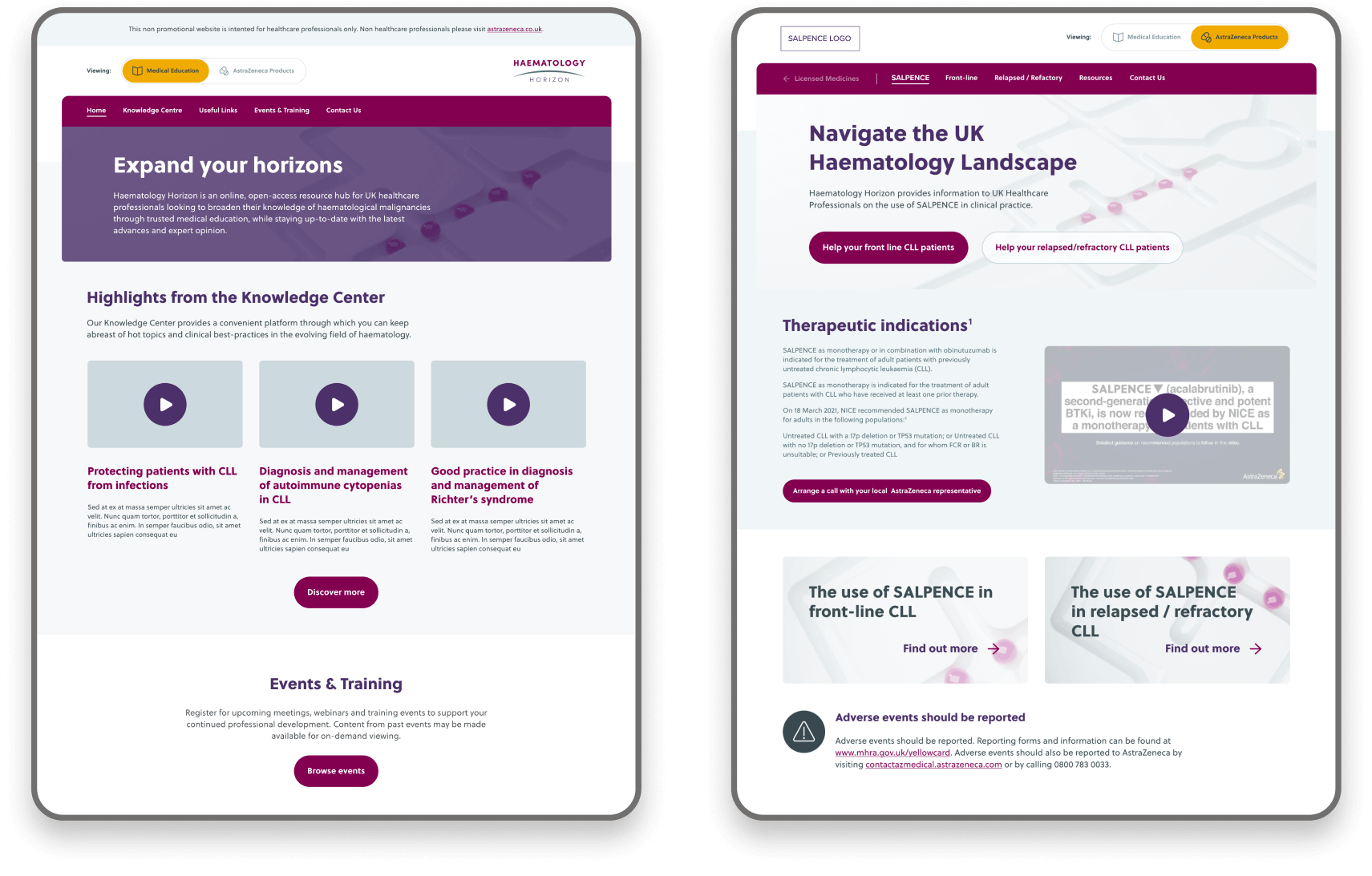
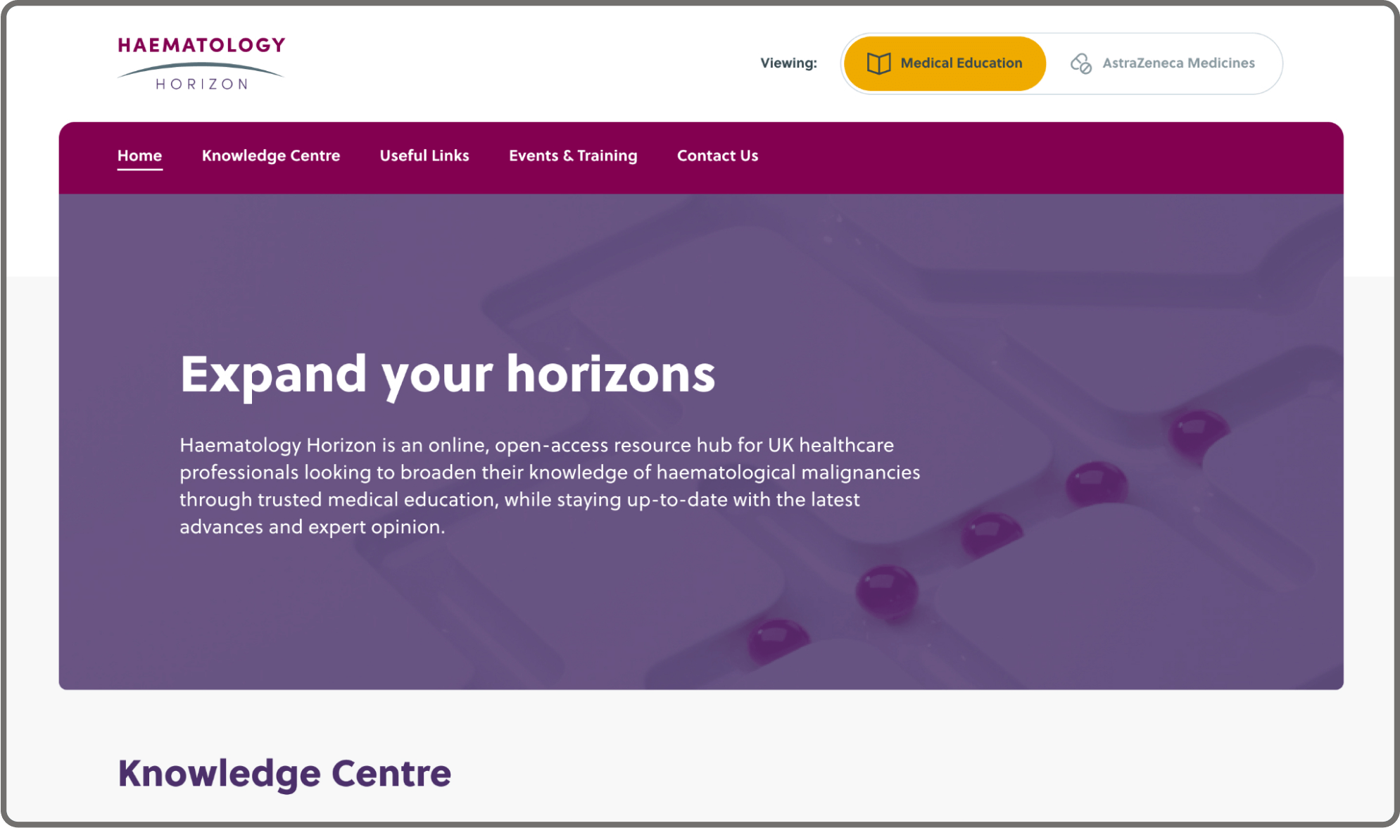
Desktop mockup showing homepage of Haematology Horizon website

The Brief

AstraZeneca launched the Haematology Horizon hub in June 2021 as an MVP. Haematology Horizon is a hub for healthcare professionals looking to learn more about AstraZeneca's core products and expand their knowledge.

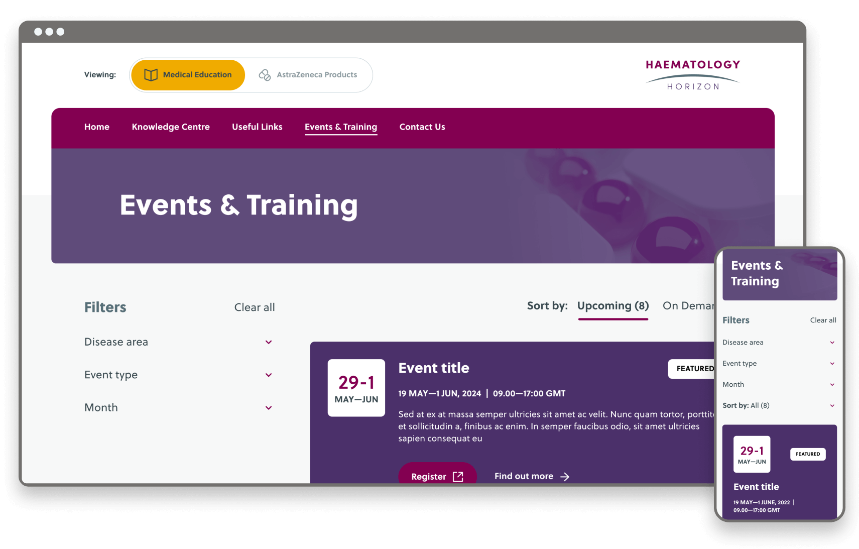
For Phase 2, AstraZeneca wanted to introduce educational content to the site called Medical Education - aimed at healthcare professionals looking to broaden their knowledge. I also reviewed the current website and suggested changes to improve the user experience and take on board user feedback.

CLIENT

ROLE

UX / UI Designer | OPEN Health

User journey flows, Visual design & Prototyping

Overview of proposed structure & navigation

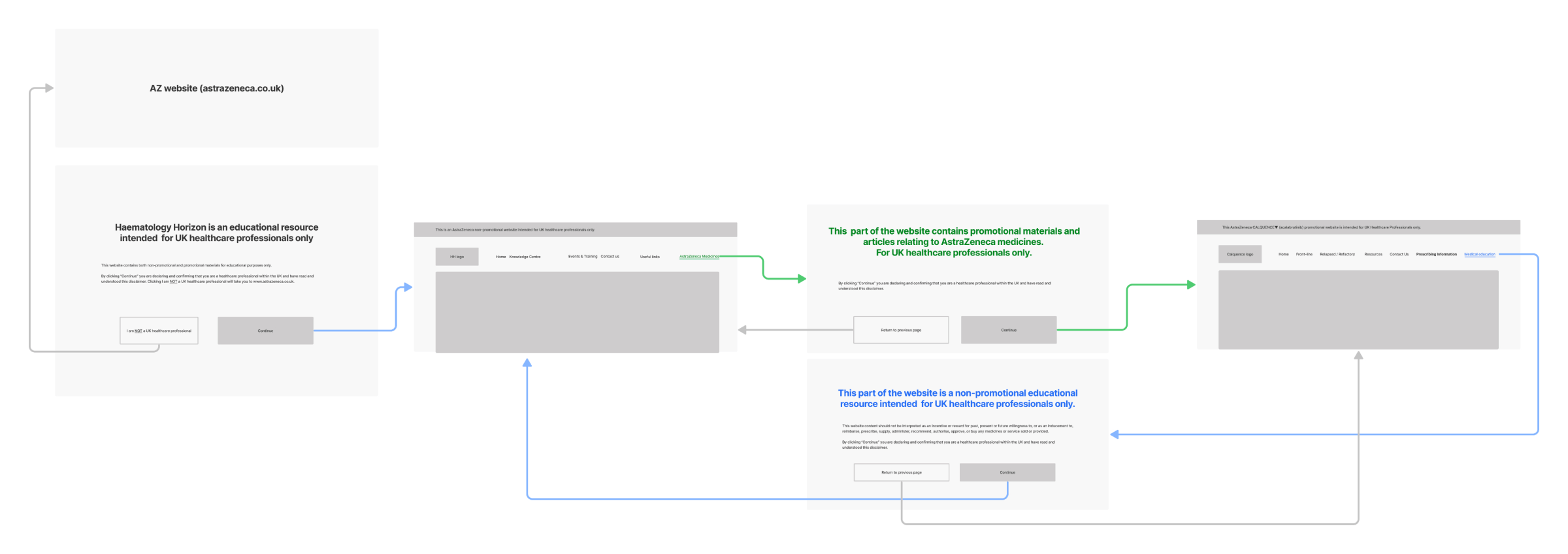
I started by creating wire flows to help map out and understand users' journeys. I wanted to ensure that both sides were easily accessible and user journeys carefully considered.

Due to compliance reasons, disclaimers appear when users enter the site and switch to the other side. The disclaimers would alert the type of content to expect, whether it was educational or promotional material.

Organic traffic / non- promo traffic

User journey flows for Organic traffic / non- promo traffic

Promotional traffic

User journey flows for promotional traffic

Navigation exploration

The next task was to explore how the navigation would work. It was vital to make it clear to users that the website had a dual aspect and make clear which side they were viewing.

CTA

Showing part of the navigation bar with menu items and a CTA on the right hand sideShowing part of the navigation bar with menu items and a CTA on the right hand side

The CTAs are too similar and not enough for users to differentiate between them when switching to the other side of the site. Additionally, there is a risk of the user not reading the CTAs thoroughly and getting confused.

CTA + supporting text

Showing part of the navigation bar with menu items, on the right hand side there is switch to copy above the CTAShowing part of the navigation bar with menu items, on the right hand side there is switch to copy above the CTA

This option feels unbalanced - there is little room for flexibility if additional menu items are added. Overall, it looks too busy and quite overwhelming.

Switch buttons

Showing part of the navigation bar with menu items, on the right hand side there is a switch icon and switch to: AstraZeneca Medicines in an orange boxShowing part of the navigation bar with menu items, on the right hand side there is a switch icon and switch to: Medical Education in an orange box

This option is too large and overwhelms the navigation. Again, there is no room for flexibility if menu items are added to the navigation.

Toggle switch

Showing part of the navigation bar with menu items, on the right hand side there is a toggle switch between AstraZeneca Medicines and Medical EducationShowing part of the navigation bar with menu items, on the right hand side there is a toggle switch between AstraZeneca Medicines and Medical Education

The toggle switch is an excellent alternative to the CTA, making it easier for users to gauge which side they are on. However, the toggle takes up a lot of space and needs to be more balanced within the navigation.

Conclusion

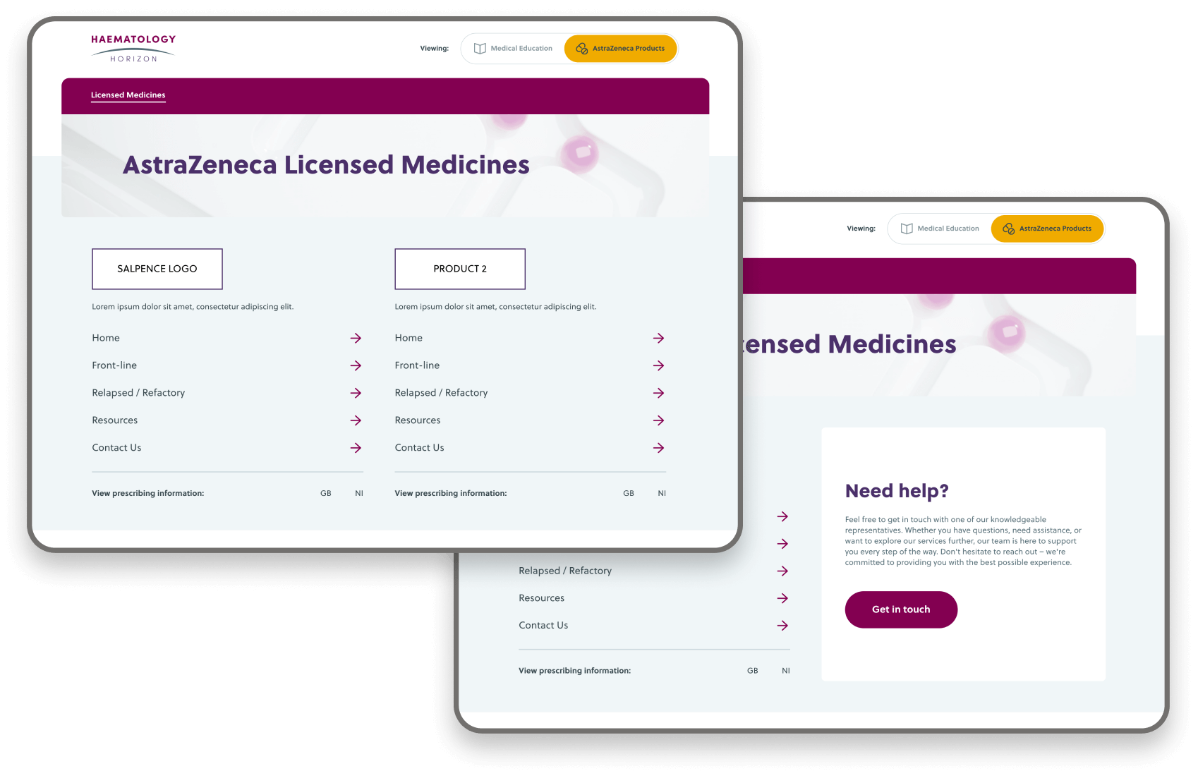
Final navigation design for AstraZeneca MedicinesFinal navigation design for Medical Education

Overall, there is too much going on in the navigation. I needed to reduce some items from the navigation so it is less overwhelming and the user can focus on one thing at a time. I liked the toggle switch and wanted to go forward with this option.

I liked the toggle switch and wanted to go forward with this option.I separated the toggle switch and navigation. The toggle switch sits on the right-hand side, drawing emphasis and highlighting which side of the site is being viewed. The navigation sits below within the hero section, which futureproofs the site and gives more flexibility to the navigation.

Other projects