Oncology in Practice

A refresh of an independent educational platform exclusively crafted for healthcare professionals seeking to amplify their expertise in the realm of oncology.

Website mockup showing the Oncology in Practice home page

The Brief

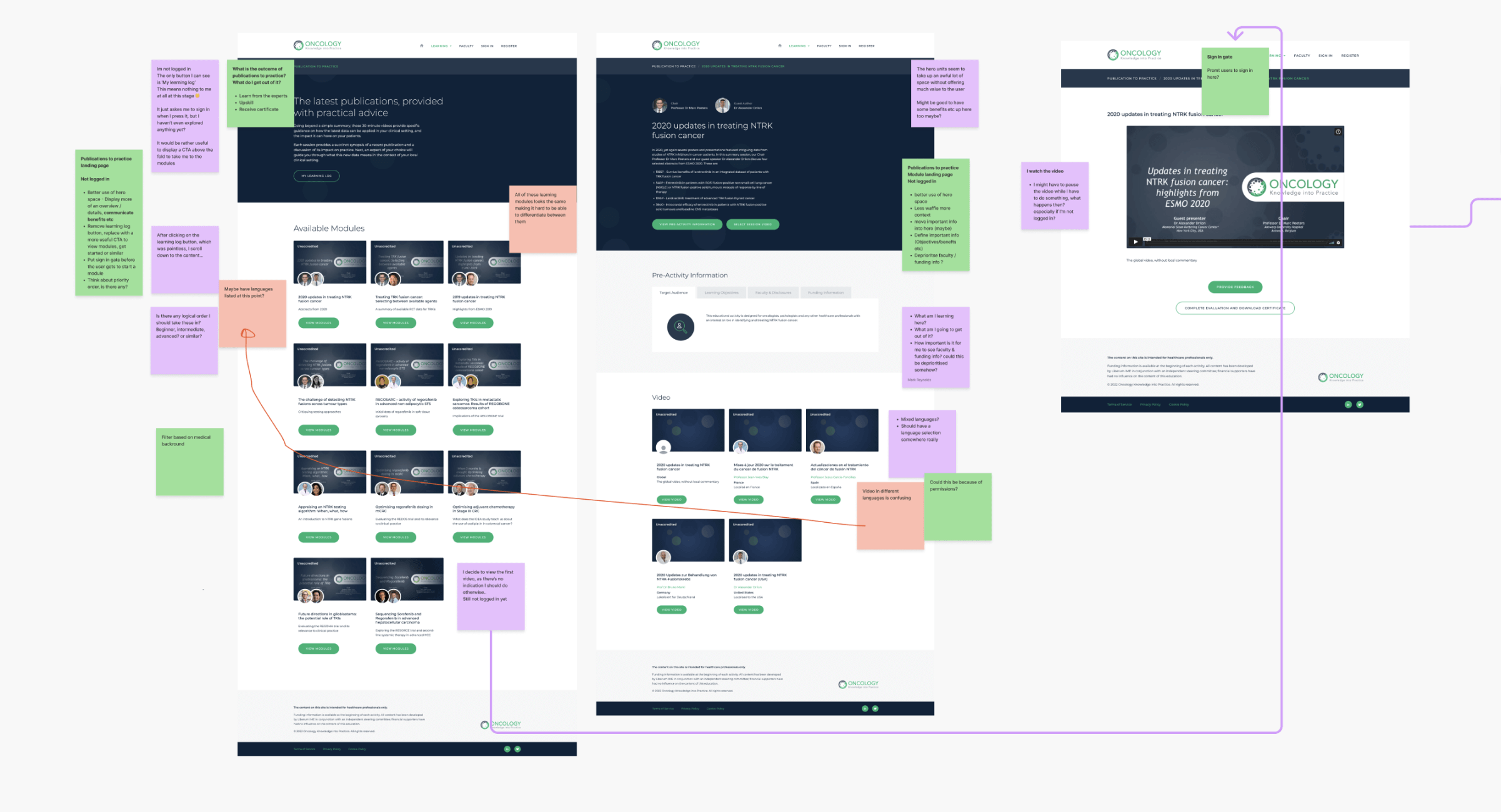
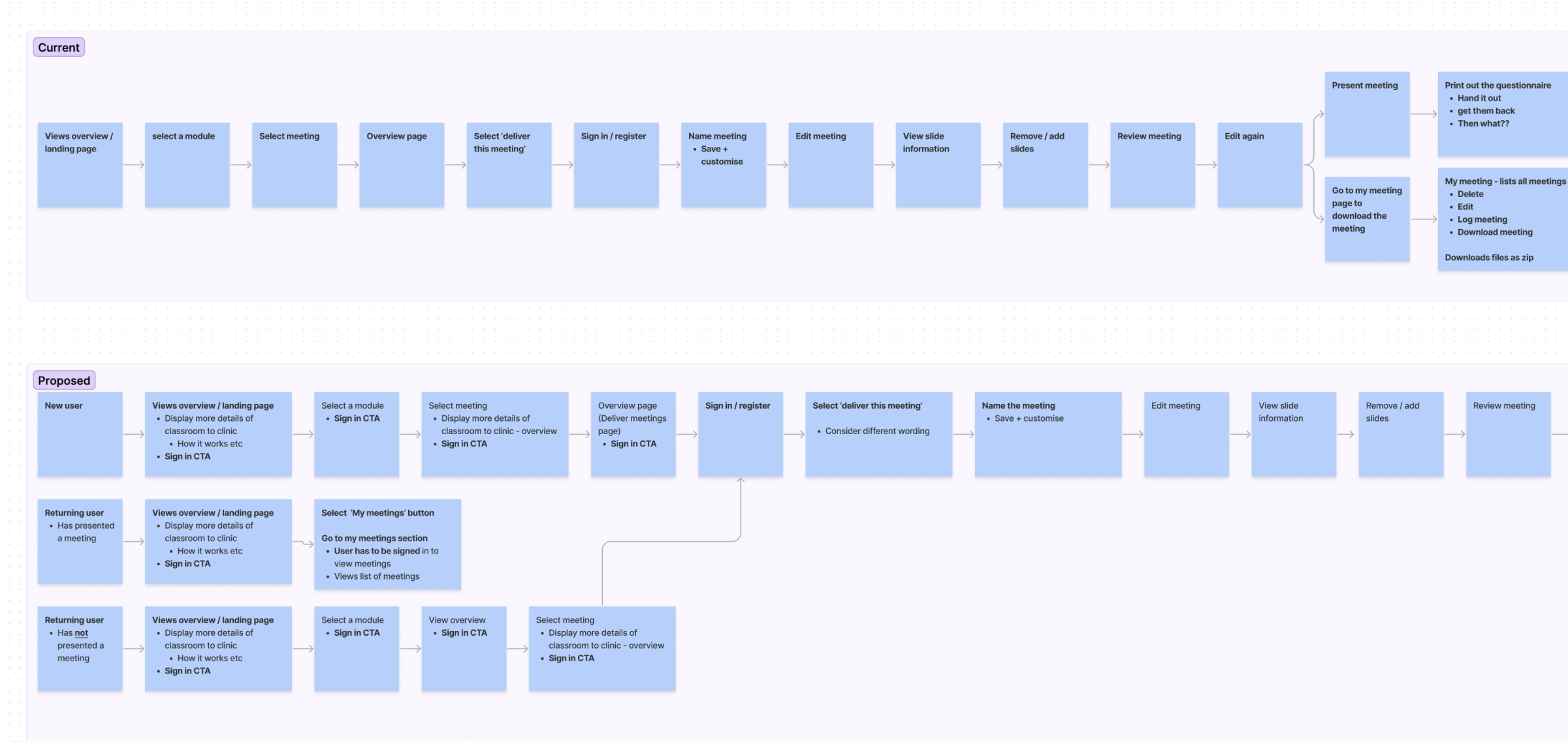
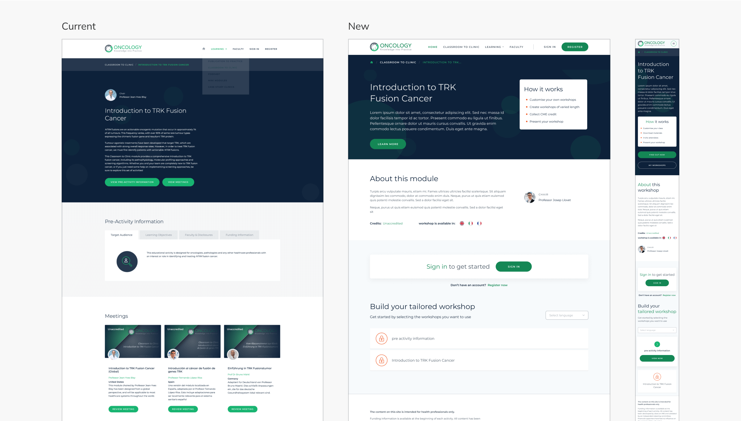
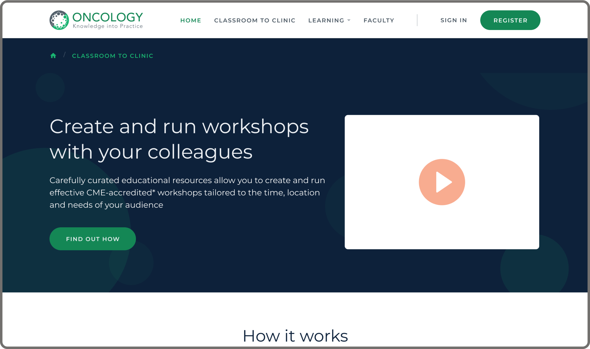
Oncology Knowledge into Practice is a free independent education hub, serving healthcare professionals with a wealth of resources.

However, as the platform evolved to incorporate new features at a rapid pace, user experience suffered, leaving visitors bewildered and unable to access desired information. Collaborating closely with another UX Designer, our mission was to identify the site's pain points and deliver a comprehensive refresh, ensuring seamless navigation and enhanced usability for all users.

CLIENT

ROLE

UX/UI Designer | OPEN Health

UX audit, Competitor analysis, User story mapping, Wireframes & UI design

UX Audit

A complete UX audit of the site was done first, by taking screenshots of each page on the current website and meticulously going thru each journey, showing the current flows, making notes and suggestions for improvement.

UX audit showing screenshot of a small section of pages full of annotations, post its and arrows to show the current flows

User flows

User flows for each section were meticulously crafted using FigJam and post-it notes, outlining current user journeys and potential scenarios. Proposed options were then developed to showcase various user types and scenarios within the flows.

These user flows serve as invaluable tools for understanding, analysing, and optimising the user journey, ultimately ensuring a seamless and intuitive experience for users. By mapping out these journeys, we can identify pain points, streamline processes, and enhance overall usability.

User stories showing the current flow and proposed flow of Classroom to Clinic section

Competitor analysis

A comprehensive competitor analysis was conducted, involving thorough research and analysis of various websites.

This process included a meticulous evaluation of their strengths and areas for improvement. By closely examining the competition, we gained valuable insights that informed our own approach and allowed us to identify opportunities for differentiation and improvement in our project.

This comprehensive study informed design decisions, leading to a more informed and effective approach to the project. By leveraging insights gained from this research, we were able to create a design solution that meets the project's objectives and addresses user needs more effectively.

Competitive analysis of competitor page showing annotated notes and post it notes

The hybrid approach

As part of the Minimum Viable Product (MVP) development of the site, our primary focus was on redesigning the homepage and the "Classroom to Clinic" section.

We opted for a hybrid approach, leveraging existing high-fidelity designs and wireframes to streamline our process. We amended the high-fidelity designs to enhance intuitiveness and user-friendliness while reworking certain sections as wireframes.

This strategy aimed to avoid duplicating efforts by re-creating the entire site in wireframes when key design components were already established at a high fidelity.

Hybrid design (part wireframe, part design) showing a range of pages in progress

Classroom to clinic

Classroom to clinic serves as a platform for educators to teach modules by creating customisable slides that can be downloaded and utilised in teaching sessions. Additionally, learners are encouraged to complete pre-assessment forms before and after the module to gauge their learning progress effectively.

About the module section provides detailed information on modules, including the module chair, available credits (if any), and supported languages. Build your tailored workshop has been streamlined with linear steps for users to follow. Icons serve as visual cues, with a lock or tick indicating progress.

Furthermore, to accommodate different languages, the workshop slides support a dropdown menu on the right-hand side, allowing users to effortlessly switch between languages, eliminating the need for multiple cards with language options.

Classroom to Clinic showing the old designs vs the new design

Other projects